![]()
Family Travel Photographs.com provides the following travel photography tutorial for photography and family traveler enthusiasts.
The Eyes Have It
Follow your subject's eyes to maximize the impact of your travel photos' composition
Imagine you're walking along a street and you pass someone who is just standing there, looking up to the top of a building. What will you do? Chances are, you're going to look up as well to see what they're staring at. It's a natural reaction to follow someone's eyes, and this holds true for your photos' subjects as well.
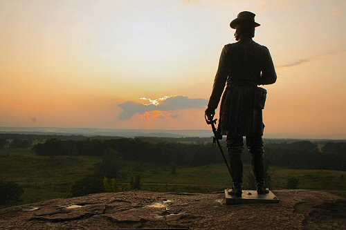
Back to Gettysburg and General Warren's statue at Little Round Top. The fact that the sculpture is looking to the left draws your eyes in that direction so the smart composition for this image is to position the statue to the right side of the image. Your eyes will naturally follow the statue's eyes, which lead you into the landscape on the left side.
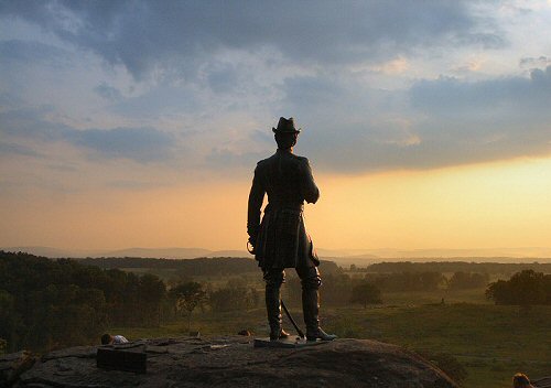
Here's a second photo of the same statue. In this case, the sculpture is centered in the photo. Note which way he's looking - straight ahead. Even though you're looking at the back side of the statue, it's still natural to follow the subject's lead and look to where it's looking.
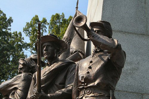
Here is a poorly composed photo. The subjects are all to the left or the center, but they're looking left - they're looking out of the picture. The wall to the right serves no visual purpose.
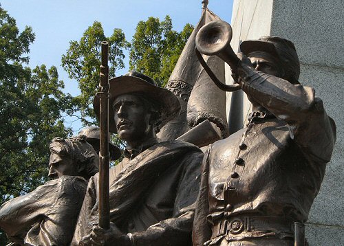
Here is a better composition for this photo. The frame is filled from side to side so the direction of their glance isn't as significant.
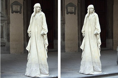
Look at the photo to the left, of a human statue in Florence. THIS is bad composition. The subject is placed to the right and is looking right, out of the picture. There is nothing of interest to his left so there is no reason to give it two-thirds of the image. The version to the right is much better. The figure is centered in the image. If you wanted to use the rule of thirds here, you would position the subject along the left side, so his view to the right would draw your eye to the largest area of the photo. Center or left works for the subject in this shot - putting him to the right doesn't.
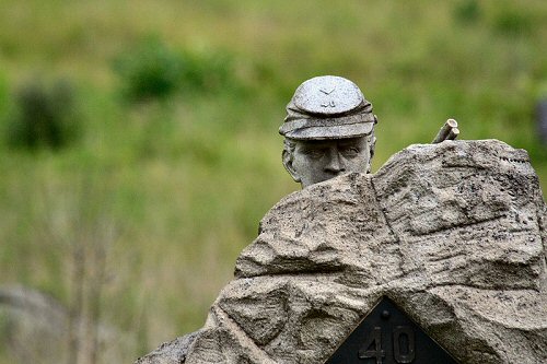
Here is a really dumb photo. It's dumb because it could be a great photo, but it's poorly composed. The rock and the soldier are very interesting. The background is out of focus and there's nothing on the left side that isn't there on the right side. So why didn't I follow the soldier's eyes and position the subject to the left side? (That question is rhetorical, incidentally; I'm the one who screwed up, not you.)
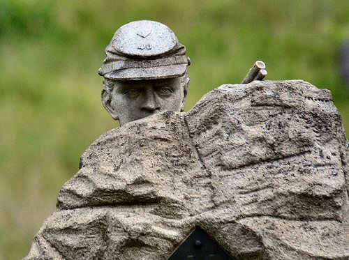
Doesn't this look better? I've cropped it to improve the composition.
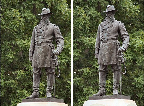
Look at these two photos. Which do you like? Personally, I prefer the photo to the right, which is centered and not positioned based on the basis of the subject's eyes. The reason for this is simple: When you follow the subject's eyes, what do you see? Nothing. There is nothing to the left of the subject to offer any visual interest, so there is no real reason to incorporate that into the composition. As you can see, this technique of composition is not set in stone. There are times when it serves your purpose to break the rules.
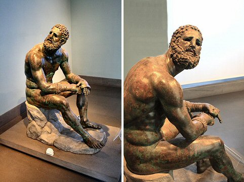
Sometimes you don't have much choice. In this photo (left) from the National Museum in Rome, the boxer is looking up over his shoulder. I couldn't exactly ask him to turn his head, and a wall kept me from moving to the left very far. In the photo to the right I've gone as far as I can go to draw his gaze into the lens. Both of these photos are terrific; this is an incredible sculpture from any angle.
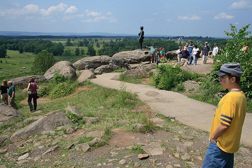
Obviously this technique applies to people as well as statues. Here you almost recreate the view Lucas is taking in from Little Round Top. I like how his pose matches the pose of General Warren's statue in the middle of the photo, as they both take in the incredible view.
Again, following the eyes is not a hard-and-fast rule. It's a technique to use in some situations, especially where the setting is important to the photo's message. Following the eyes is a good technique to use for travel photography though, because you frequently want to show not only your subject, but the setting where your subject is located.

