![]()
Family Travel Photographs.com provides the following travel photography tutorial for photography and family traveler enthusiasts.
Rule Your Travel Photos With the Rule of Thirds
The age old
rule for placing key elements in your photos should be your starting point for
composition
The rule of thirds is so widely discussed that I almost didn't include it on Family Travel Photos.com. However, I can't assume that you've been to other tutorials so I decided that I need to discuss it. Also, in keeping with the focus of my website I want to tie it in specifically to travel photography.
The rule of thirds, simply put, is this: In general, your photo will be stronger if you put the strongest elements of the scene at points of 1/3 or 2/3 of the way from the side or the top, rather than directly in the center.
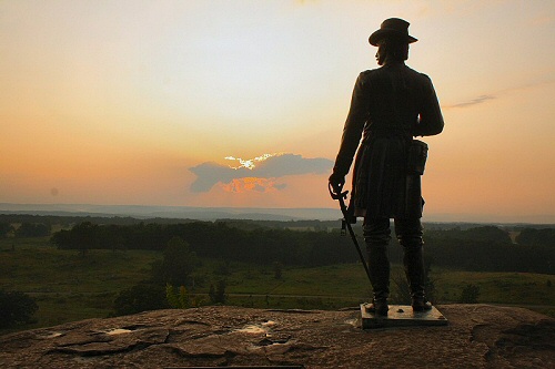
This is a well composed photo taken at Little Round Top in Gettysburg. It uses the rule of thirds very well.
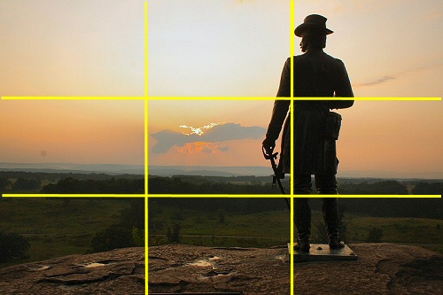
You can better see why this photo is well composed if you draw in horizontal and vertical lines at the 1/3 points of the image. Notice that General Warren's statue stands along one of the vertical lines. The horizon runs along one of the horizontal lines.
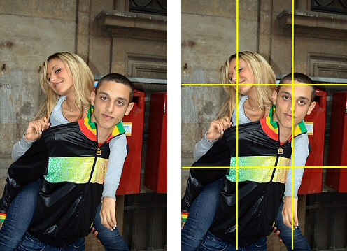
The rule of thirds applies to people pictures as well. Look at the above photo. Notice that those lines run through both subjects' faces, particularly the eyes. The focus of a person is the face, and the focus of the face is the eyes.

Here's a pretty landscape taken in the Dolomites Mountains near Venice. The primary visual elements are the mountains and the town.
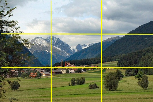
You can see the lines run right through the town, along the horizon between the town and the mountains, and through the most interesting mountains. You can learn to compose with the rule of thirds very quickly; I shot this photo out the window of a car traveling at 80 miles per hour.
As it relates to travel photos, the rule of thirds comes into play with horizons most often. Be sure to put your horizons - that line between land and sky - at either the 1/3 or 2/3 line rather than straight across the middle. If you run the horizon through the middle, you essentially cut your photo in half. So how do you decide whether to put the horizon on the 1/3 or 2/3 line? Make a decision as to which is more interesting - the sky or the land. If the sky is more interesting, put the horizon 2/3 of the way down your photo so more of the sky shows. If the ground is more interesting, put the horizon along the line 1/3 of the way from the top.
For people or statue pictures, put the people on the 1/3 or 2/3 lines (especially the vertical lines), especially if they're looking to one side or the other. If the person fills the frame, try to put the person's face along the horizontal line 1/3 from the top *as you see in the picture of the two kids above).
The rule of thirds is not universal. For various reasons, you may choose to break this rule to create a certain effect, or because some other compositional technique takes priority. Look at the picture below:
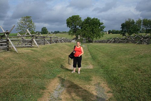
The subject is right in the middle of the shot. In spite of this, I think it's a well-composed photo. The leading lines thoughout this photo (which do follow the rule of thirds) draw the eyes very strongly to the center of the photo. Read more about leading lines.
While not universal, the rule of thirds should be the starting point for your photo composition. Train yourself to follow this rule on every shot until you do it naturally. Then, as you develop other techniques you can make the decision to override this rule when you think the situation warrants. At that point you truly will be in command of your photos.

