![]()
Family Travel Photographs.com provides the following travel photography tutorial for photography and family traveler enthusiasts.
Look for Unposed Shots - And Don't Be Afraid to Pose Them
Don't
limit yourself to shots of family just standing there - It's ok to pose your subjects
if you want
Have you ever been to some vacation spot and watched parents dutifully lining up their kids in front of one thing or another, taking the same posed picture over and over? Some of that is ok. Having a nice group shot or two is a good addition to the scrapbook. However, if that's all you're going to do, you could probably just stay home and shoot the pictures there.
Watch for opportunities to take pictures of your family as they interact with your vacation spot. There's nothing wrong with posing shots like this to get what you want.

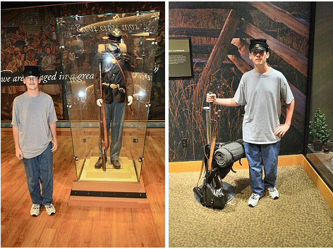
Two pictures of my son at a museum. The one on the left is a better picture of him because I could use the flash, so it removed the shadows on his face. But the pose is poor. He's just standing there. The pose on the right is much better. He saw me getting ready to shoot and posed with his hand on the rifle and backpack rig. This is a better shot because it shows him interacting with the location.

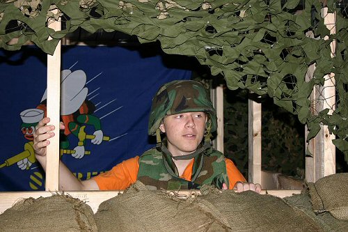
Isn't this a much better photo to show how much fun Lucas was having rather than just a picture of him standing in front of some statue?
Here's a good example of how posing can change the tone of a picture:

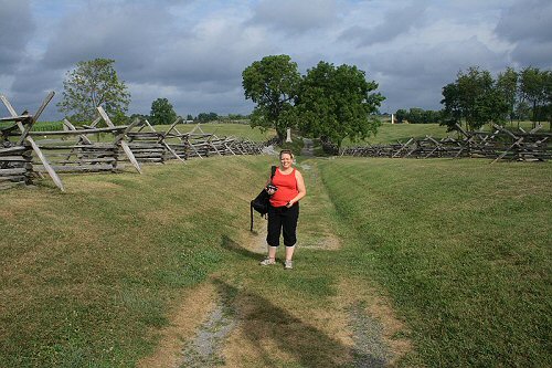
Take a look at the photo of my bride in the Sunken Lane at Antietam to the right. Not a bad picture for a family album. What's that white thing sticking out of her head? It's actually a monument well behind her, but it looks like she's wearing an Empire State Building hat or something. Really, it's not a bad photo at all. If you want a picture of your family member at a famous place, this one works pretty well. Just move her a foot or two to her left so the monument isn't sprouting out of her head and you're all set.
My biggest problem with this photo is that it really says nothing about where she's standing. It documents the fact that she went to the Sunken Lane, but with a small change it can do that AND capture the feel of the Sunken Lane as well. The Sunken Lane is a very sobering place. Dozens of men died in this simple country gully, earning it the nickname "Bloody Lane." Maybe that's what puts me off about the above photo - the big smile just seems out of place there.

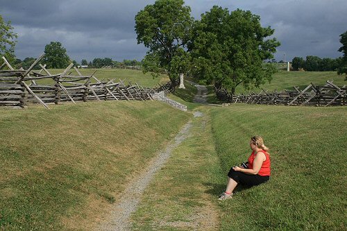
Here's a photo I like much better. I simply asked my wife to sit on the hillside rather than stand. I could have had her look into the camera, but I wanted a more thoughtful pose so I had her look to the side. The turbulent clouds in the background only enhance the mood. I moved in a little closer to make her a more significant part of the picture. Notice that the Rule of Thirds is now used more effectively. The leading lines still draw your eyes through the photo and include her. That's it. Small modification - big improvement. The first photo documents that my wife was at the Sunken Lane. The second photo talks about the mood of the Sunken Lane, where my wife was visiting. See the difference?
You may like the first photo better. That's fine - photography, like any other art, is subjective. Your best option is to shoot both angles, and then you have the luxury of picking which you like better when you get home!

